
Case study · 2025
Saru Saru
Six seconds.
Only one and a half of them move.
A logo animation built to end rather than to loop: a shockwave, a single frame of colour, and a long hold on the mark.
01
Brief
A wordmark that had to move
Saru Saru already had a mark. It needed one that could open a video.
The ask was a single asset with several jobs: a signature at the end of a film, a stinger on social, a title card over content. Short enough to sit in front of something else without becoming the something else.
02
Reference
The reference is the curve, not the picture
The starting point was the Akira explosion.
Nothing here is drawn like Akira. I took the shape of the energy: a white dome that expands faster than the eye can follow, then keeps expanding after you expect it to stop.
I set the easing from that shape. The first second runs on a curve that starts near-instant and slows for a long time, so the opening reads as a blast.
I explored three directions. In this one the mark arrives after the blast rather than inside it.
03
Timing
One and a half seconds of event
Read frame by frame, most of the animation sits still.
1.5 s
event
4.9 s
hold on the mark
Sixteen frames carry the movement. The remaining forty-eight hold the wordmark dead centre while grain and dust drift across it.
The ratio is the decision. A sting that keeps moving competes with whatever it introduces; one that resolves early hands the frame over. The hold is the deliverable.
-
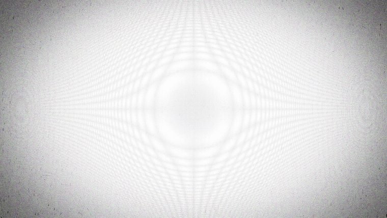
0.0 s
The blast, already at full size
-
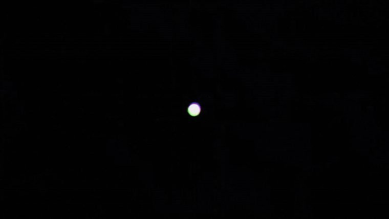
0.3 s
Cut to black. One white dot left
-
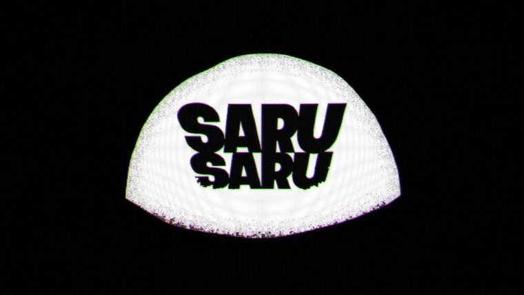
0.8 s
The mark arrives on the dome
-
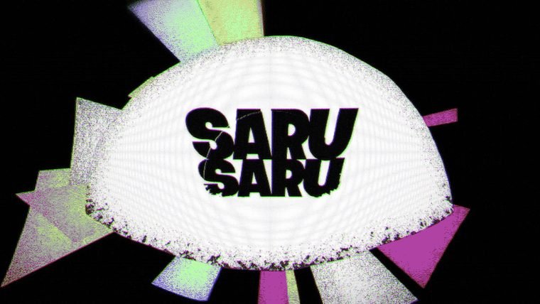
1.3 s
One frame of colour
-
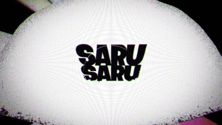
1.4 s
Blow-out
-
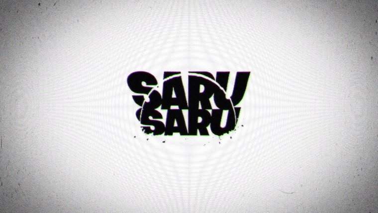
2.0 s
Locked
-
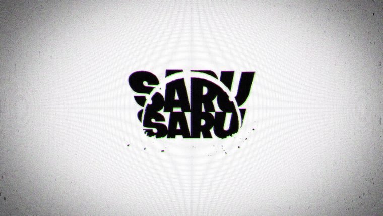
6.3 s
Still locked
04
Detail
The frame you are not meant to see
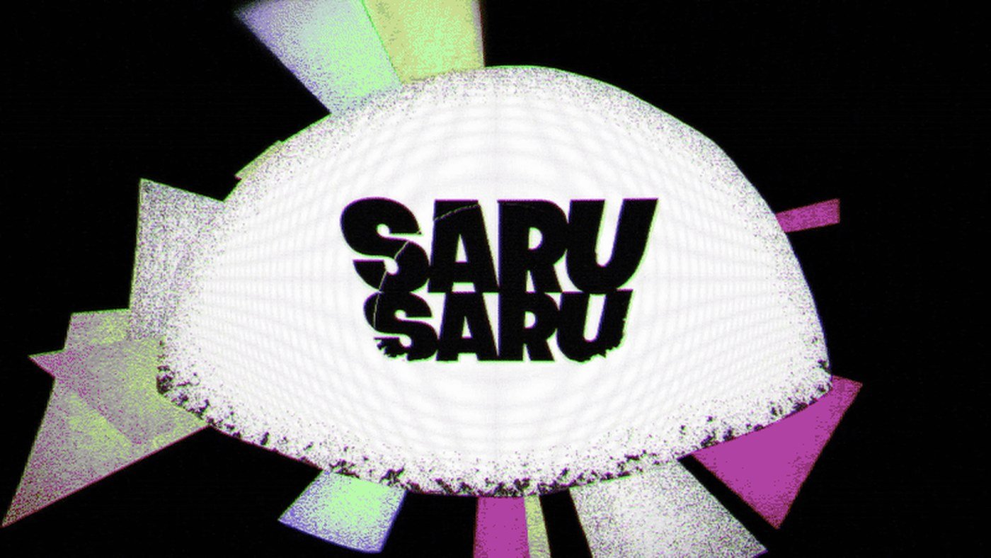
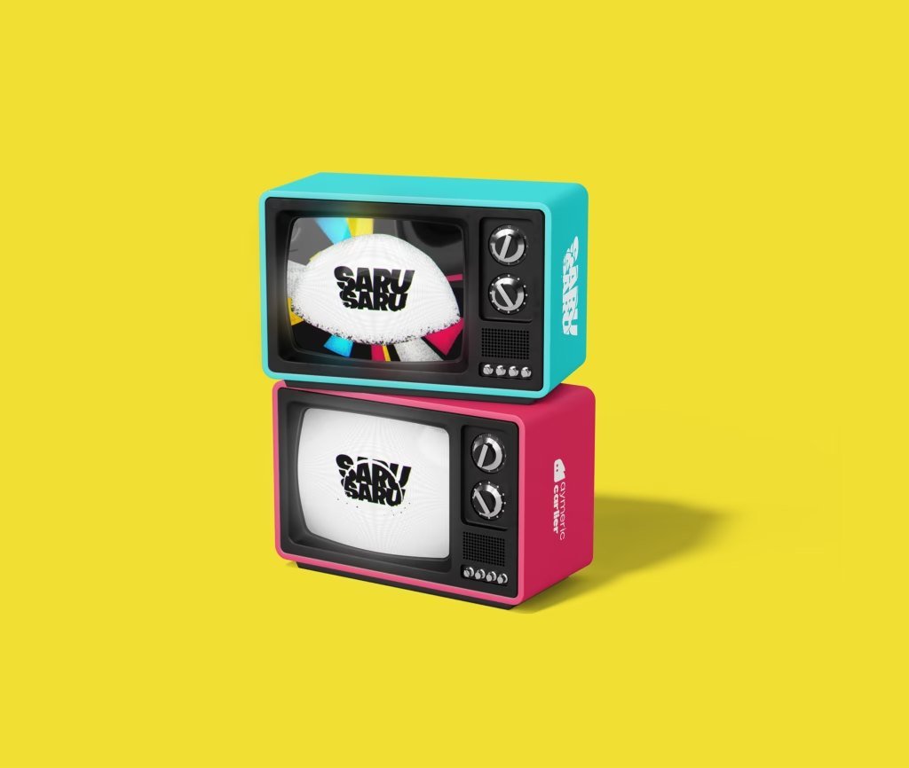
At 1.3 seconds, for one frame, the animation goes to colour.
Magenta, cyan and green shards fire out from behind the dome and are gone before the next frame. At speed you do not see colour. You see an impact.
It is the only colour in six seconds, and it is borrowed from print: the three process inks, out of register, the way a misprinted page looks. I took the texture of the whole piece from that frame: the grain, the dust and the halation around the white read from the same idea.
05
Use
Built to end, not to loop
The hold makes the asset usable.
The animation resolves to a frame it can sit on, so the same file works as an opener, as an end card and as a still. Cut it anywhere after two seconds and you have a poster. Freeze it and you have the logo.
A sting that never settles
can only ever be a sting.
06
Outcome
What the six seconds had to do
The brief was to animate a logo. The work was deciding when to stop.
The first quarter of the runtime holds the movement, the rest holds the name. You watch because of the blast. You remember because of the hold.
Sixteen frames of noise.
Forty-eight of silence.