Case study · 2026
Plami
From “What are we eating tonight?”
to a week already planned.
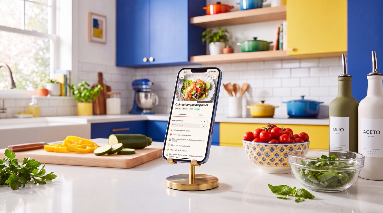
Plami is a meal planner for the phone. You choose seven recipes. It writes the week and the grocery list that goes with it.
01
Problem
The problem
Planning meals looks easy until you do it every week.
You need ideas. You need to remember who eats what, check which pans you own, skip the ingredients nobody touches, work out portions for the household, then turn all of it into a list for the shop.
Recipe apps hand you inspiration. They leave you the decisions.
So I built Plami around one task.
Choose seven meals you want to eat. Plami takes care of the rest.
02
Interaction
Designing around decisions, not recipes
I kept the core interaction to one gesture.
Plami shows one recipe at a time on a large card. You swipe or tap to keep it or skip it. A counter gives you a target.
0 / 7 7 / 7

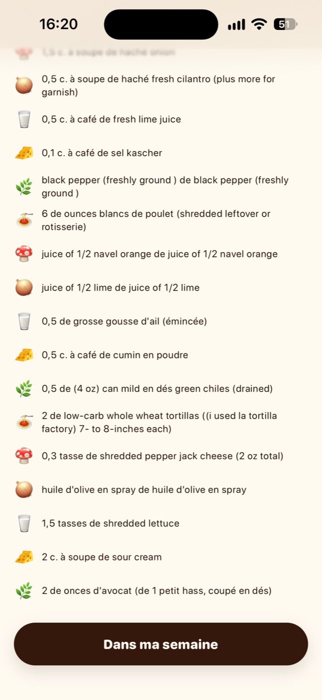
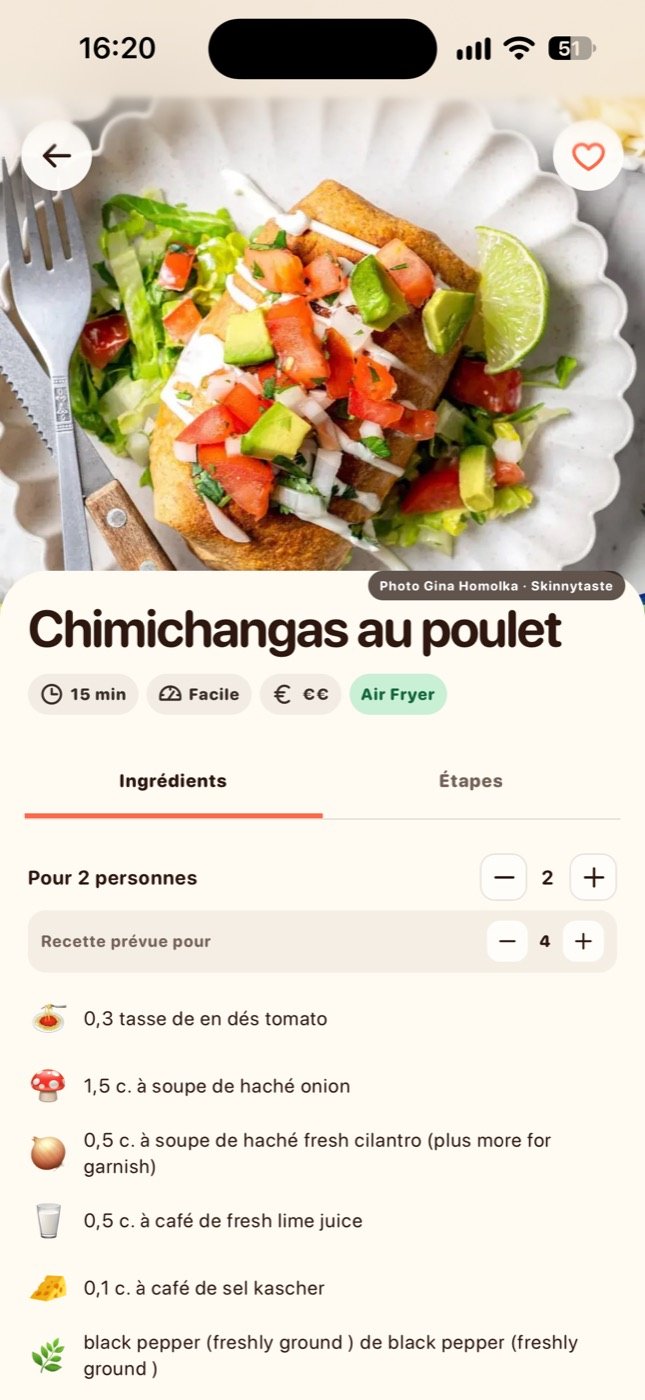
On the seventh pick, Plami builds the week.
You see one thing at a time, so filling a week feels like browsing rather than filling in a form. You make the decisions and Plami fills the calendar and the list.
Miam or pass.
03
Onboarding
Personalisation from the first launch
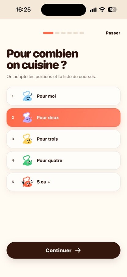
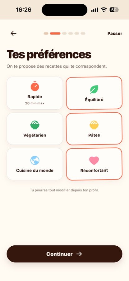
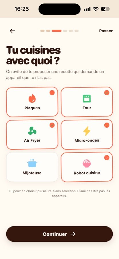
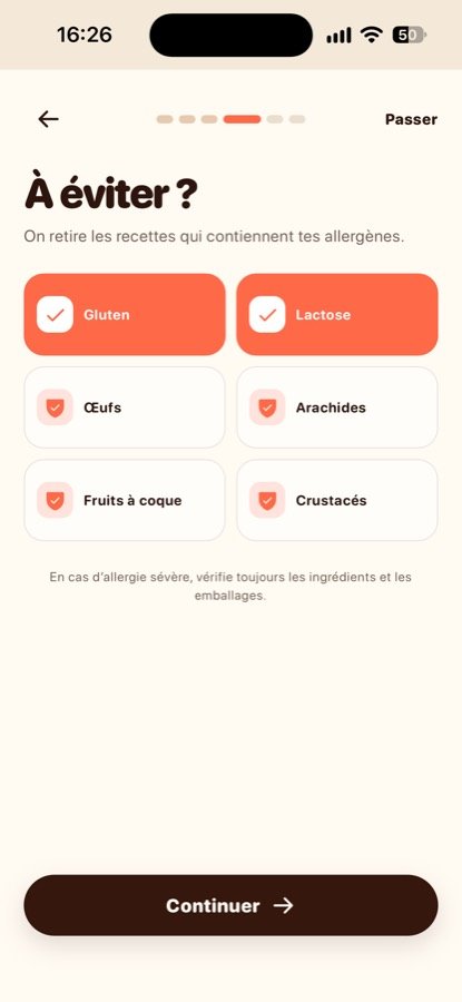
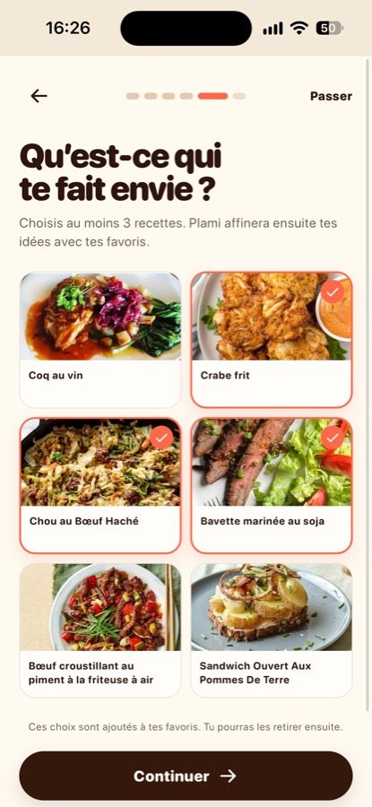
Onboarding runs six steps and asks how you cook.
Household size, food preferences, the equipment in your kitchen, allergens, and a first pass at recipes you like the look of.
Those answers drive the recommendations.
Own an Air Fryer and no oven, and the oven recipes stay out of your feed. Eat no meat, and you never filter a screen. Cook for four, and the quantities say four.
I put all of it in the first two minutes rather than a settings page.
04
Algorithm
Recommendations that learn over time
A shuffled database would have been quicker to build. Plami reads two things instead.
Your onboarding answers, and what you like, skip and save. Together they build a taste profile across categories, cuisines, tags and ingredients.
Hard filters sit on top and drop anything that breaks a constraint: allergens, cooking time, diet, equipment.
I also wrote diversity rules. They cap repeated proteins, cuisines and dish families, and compare ingredients across the seven.
The feed balances two goals that pull against each other:
Show me food I will like, without showing me the same thing seven times.
Recommendation system
How one recipe gets ranked
Every recipe crosses three gates. Most do not make it through.
-
Taste profile
What you like, skip and save. It moves the score.
-
Hard filters
Time, diet, allergens, equipment. No score survives these.
-
Diversity rules
Caps on protein, region and dish family, and on shared ingredients.
-
Pesto pasta
Kept
-
Veggie curry
Over 30 minutes
-
Shrimp noodles
Contains crustaceans
-
Lemon chicken
Already two chicken
-
Tomato pasta
70% same ingredients
05
The week
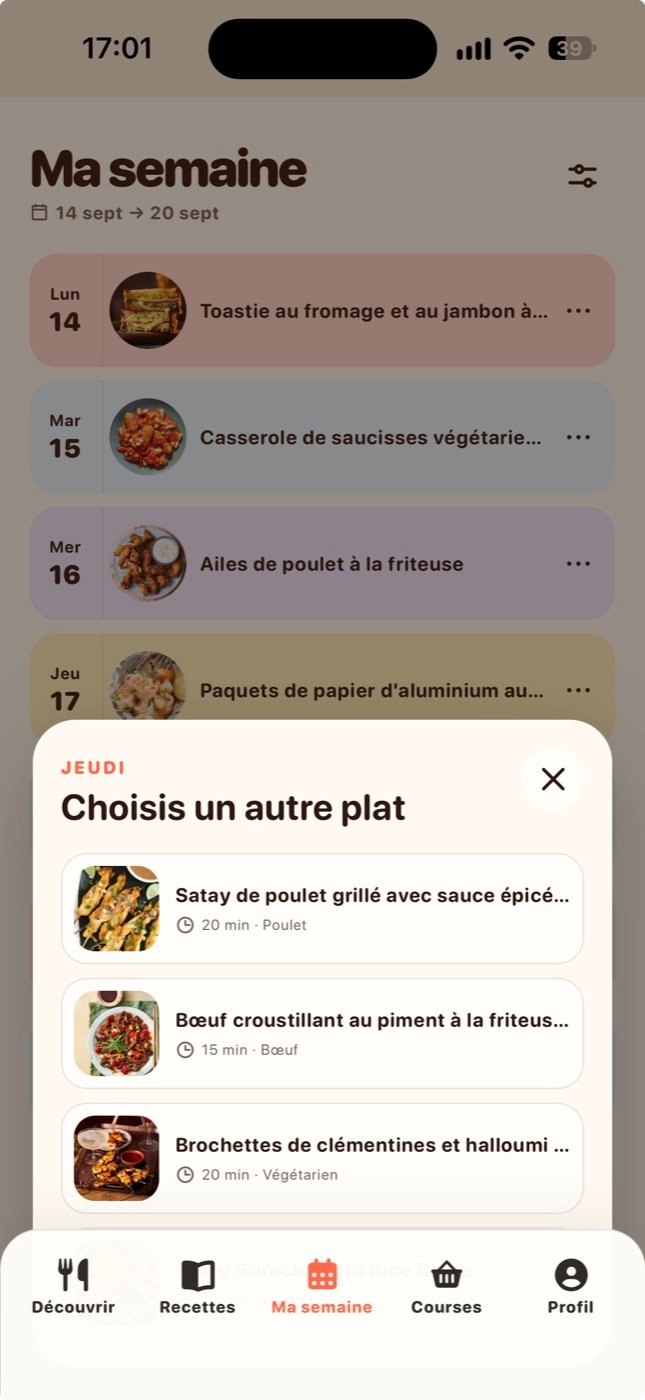
Seven choices become a week
The seventh pick ends the browsing and starts the planning.
Plami spreads the seven recipes across Monday to Sunday and lays them out as one colourful week. You can swap any meal without starting over.
Finishing the week earns a celebration before the plan appears.
I spent longer on that half second than on the screen it leads to.
The line on screen reads:
“Your week is sorted.”
06
Groceries
From meal plan to grocery list
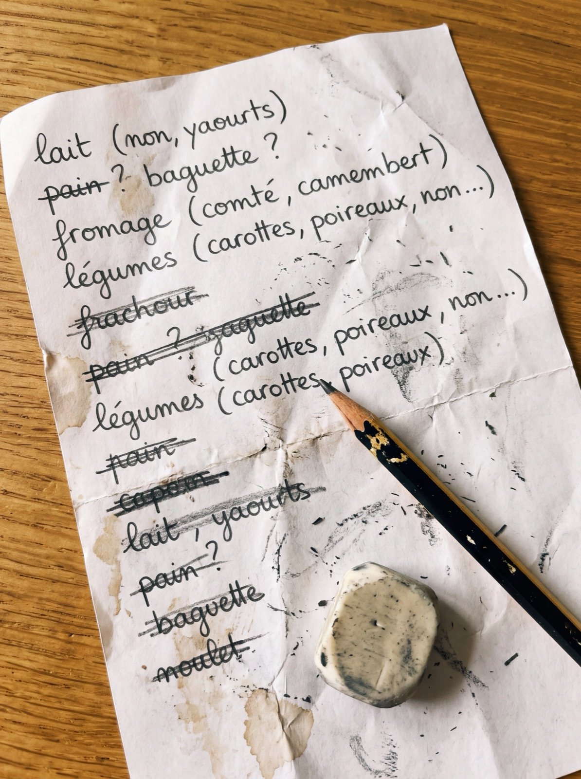
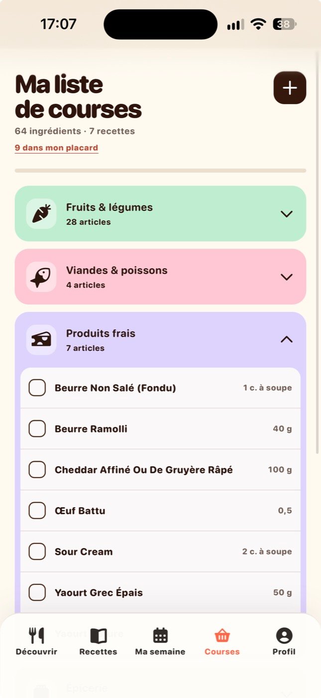
The list comes out of the seven recipes.
Stacking their ingredients end to end would give you a mess, so Plami normalises names and units first, then merges the quantities that can merge. It scales to the number of people you cook for.
Items land in the aisles you already walk: produce, fresh, meat and fish, pantry, frozen, condiments.
You tick things off in the shop, add your own, and mark what already sits in your cupboard so it drops out of the next list.
Each choice you make early should delete work later.
07
Catalogue
Beyond the weekly swipe
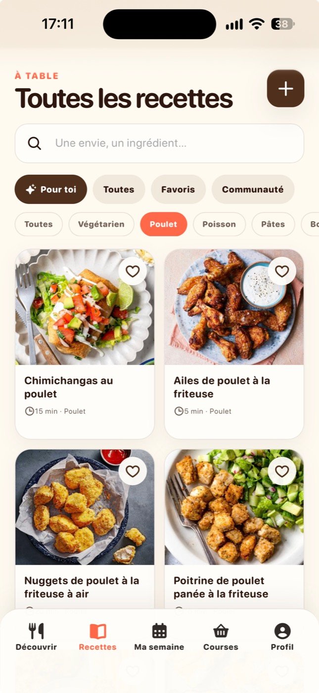
Swiping is the fast path. There is a slower one for people who want to browse.
The catalogue carries search and category filters, split into recommendations, everything, your saved recipes and what the community shared.
Open a recipe, change the portions, read the steps, save it or drop it straight into your week.
You can publish your own, which is where a planning tool turns into a small cooking community.
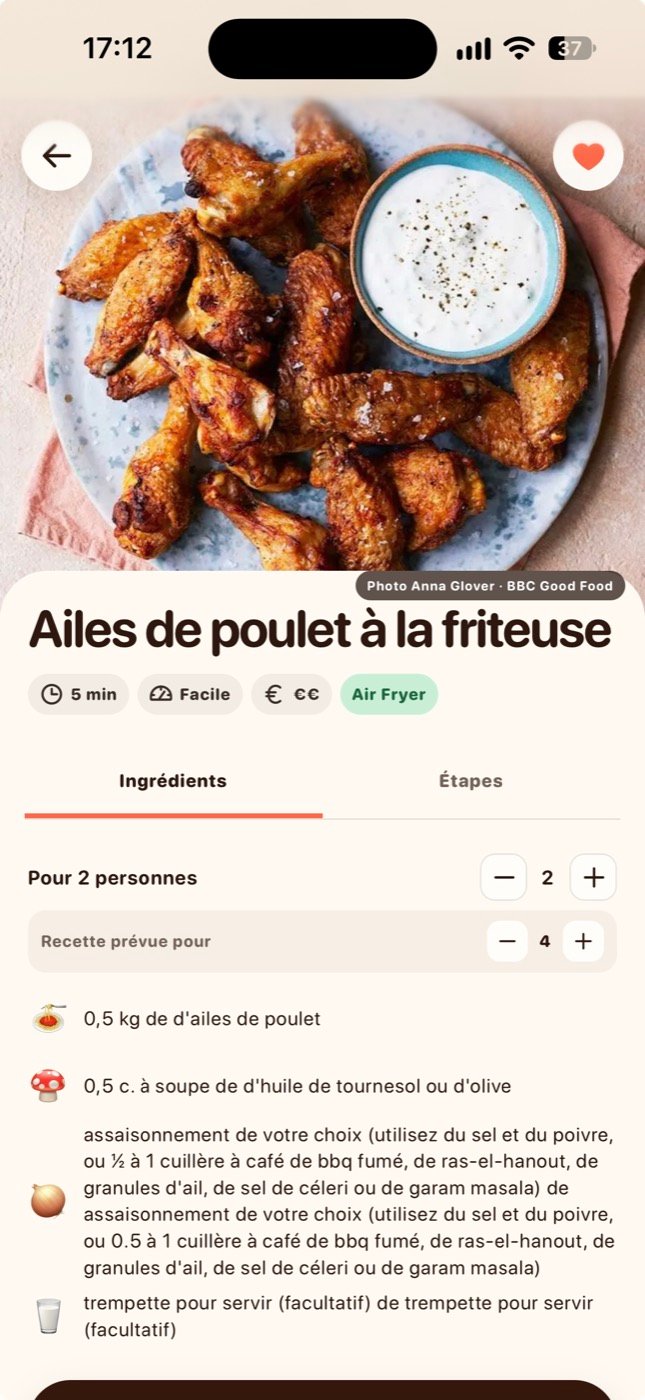
08
Data
Building the recipe catalogue
A recommendation is worth nothing if the catalogue behind it is thin.
I built a pipeline that collects recipes from several sources, then normalises, classifies and validates them.
- 997recipes processed
- 160Air Fryer recipes
- 100%image coverage



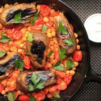
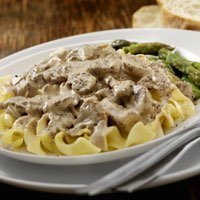
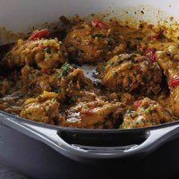

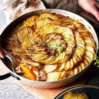
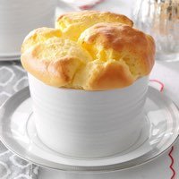

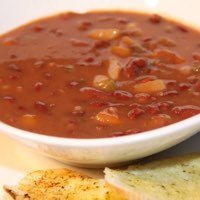


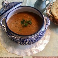
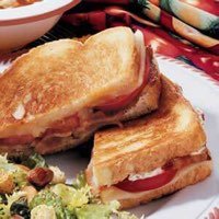
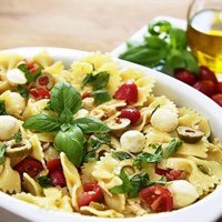
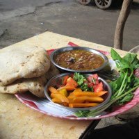



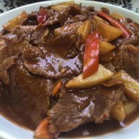
Each recipe carries its cuisine region, diet, equipment, prep time and quality metadata. That structure is what lets Plami work out which recipes fit your kitchen.
09
Identity
A brand designed to make planning feel lighter
Meal planning is a chore. The identity had to stay away from productivity software.
I built the palette out of food:
Soft surfaces, rounded type, colourful cards.
A small Plami character turns up through the product in different moods. It celebrates a finished week, sleeps through an empty state and walks you through onboarding. The mascot carries the functional moments.
- An empty state stops reading like an error.
- Onboarding stops reading like a form.
- Finishing a week feels worth something.

-
Coffee
#50301B
-
Cream
#FDF1E1
-
Cloud
#E5F5FF
-
Onion
#C4ABFE
-
Radish
#FD8BA5
-
Sky
#8BD0FD
-
Basil
#42CB79
-
Lemon
#FFCF53
-
Tomato
#FE6948
-

Happy
-

Love
-

Sleep
-

Veggie
-

Wink
10
Motion
Motion as feedback
Motion carries as much of the personality as the colour does.
Cards rotate under your thumb and spring back, with MIAM and PASS readable through the whole gesture. Transitions carry you through onboarding, the counter keeps the seven in view, and a short celebration closes the week.
I kept it functional. Every animation answers what happened before it tries to entertain.
Quarter speed
11
Platform
Designing for the phone first
I designed Plami for the phone before anything else.
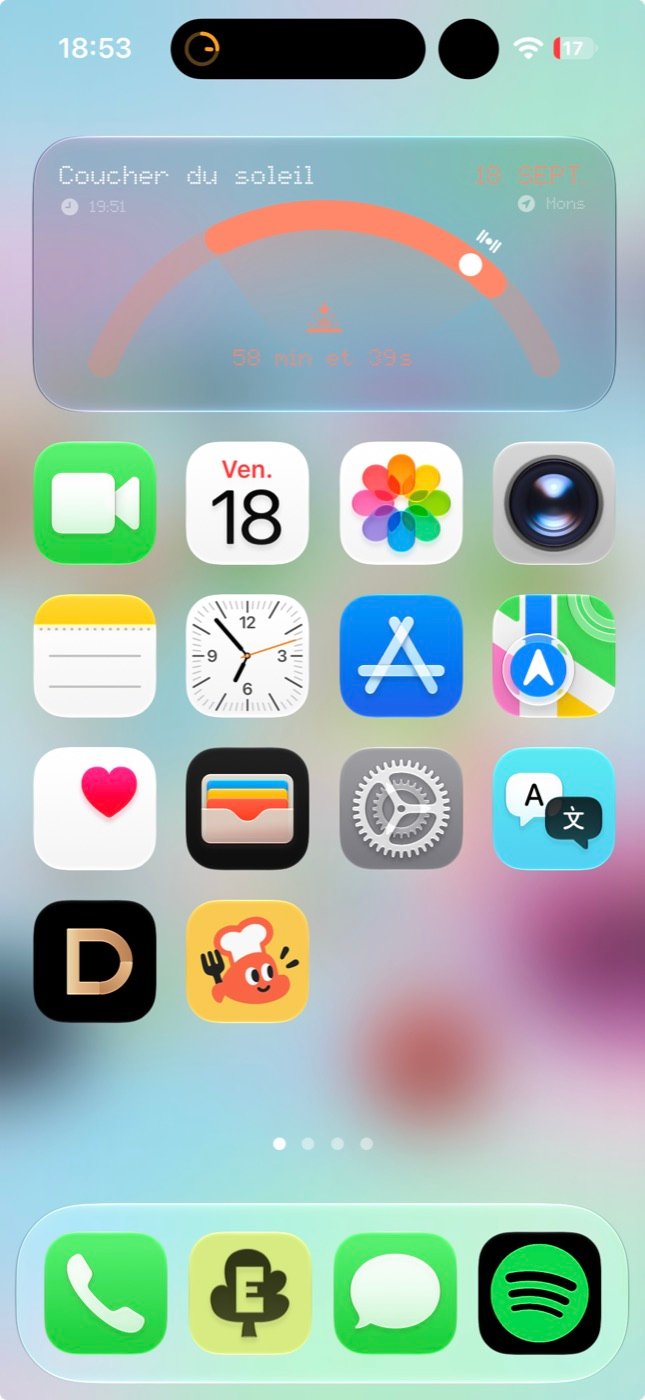
The layout sits inside a compact mobile viewport and respects safe areas. It ships as a Progressive Web App, so it installs to a home screen and still opens from a link.
Firebase handles auth and sync, so your preferences, saved recipes and current week follow you between sessions.
12
Outcome
What Plami became
An idea about finding recipes turned into a harder question:
How do seven small decisions clear a week of mental load?
The answer was a chain where each step feeds the next:
- Preferences
- Recommendations
- 7 choices
- Weekly plan
- Consolidated grocery list
Nothing in that chain asks you to repeat yourself. That is the product:
Less planning.
More eating.