Case study · 2025
Weekend Matrimoine
Heritage carries a father’s name.
This one took its mother’s.
The first Week-end du Matrimoine, at the Hôpital Notre-Dame à la Rose museum. One identity, and every format the weekend needed.
01
Context
A word most people meet for the first time
Matrimoine is a real word, and a young one.
Patrimoine, heritage, carries a father in it. Matrimoine is the half handed down by women, and for most of the people who walked past the poster, the word was brand new.
The identity had to carry a definition, an invitation and a date at the same time, to an audience that had never heard of the event or of the word naming it.
02
Brief
Three organisations, no visual capital
The museum ran the weekend with CGSP Wapi and PAC Wapi.
Three partners, three tones of voice, three logos to place. And a first edition, which starts from zero: no audience, and nothing recognisable to lean on.
It also had to stretch a long way:
- Talks, a choir, guided tours
- An ecofeminist workshop and a hypno-relaxation session
- A playful trail and a drop-in desk
Three days, seven speakers, six kinds of event, and nothing anyone had seen before.
03
Name
The line does two things at once
À ta place means take your place.
It is also the sentence used for centuries to send women back to theirs. The poster says it with an exclamation mark and no apology.
A reclaimed insult is the shortest summary of what the weekend was for. You read it before you look at a single picture, which is what a first edition needs.
À TA PLACE !
Week-end du Matrimoine
04
Colour
Six flat colours, no gradients
Saturated and unsubtle on purpose.
The palette had to hold on a 60 g flyer, on a vinyl sticker and on a backlit phone, and stay legible from the other side of a street. Every colour is a flat fill.
Red
#EA0B10
Flame
#F5A34E
Yellow
#FCD518
Green
#059148
Blue
#05AEE9
Pink
#ECB6D0
The type does the other half. One geometric sans, two weights: heavy for the shout, light for the practical detail of dates, address and QR code. Nothing in between, so a reader sorts the hierarchy at a glance.
05
One system, every format
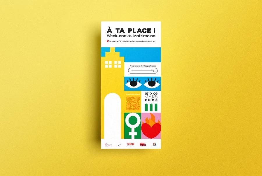
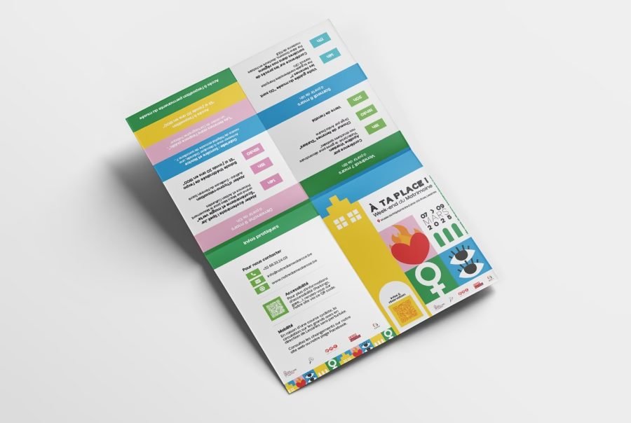
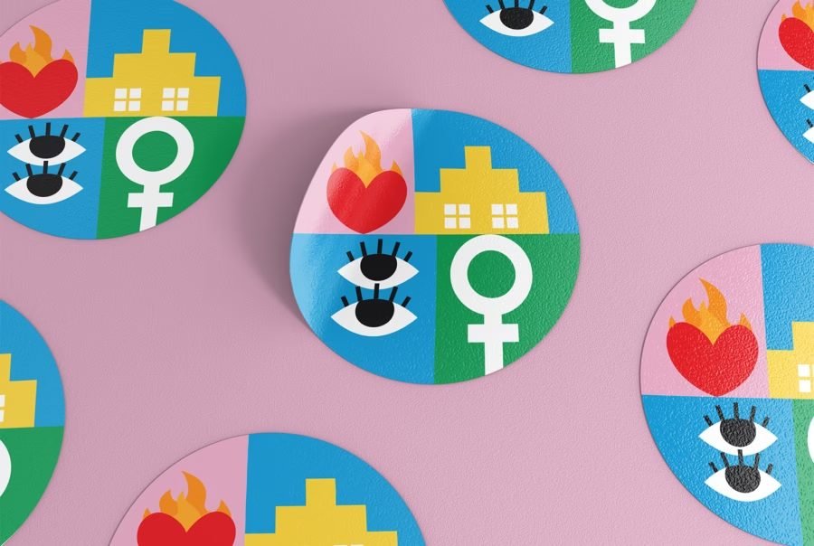
Poster, long flyer, A6 leaflet, sticker, bookmark, plus signage inside the museum.
The identity is built as a grid of flat squares, and squares tile. So the same pieces fill whatever shape the campaign needs. The poster takes a block, the flyer stacks a column down the page. The sticker crops a square through a circle, and the bookmark runs one square wide.
Nothing was redrawn between formats.
The grid was re-cut.
The leaflet is where that pays off. A programme spread over three days needs colour to separate the days, and the palette was already there to do it. No new rule, no legend to read.
06
Social
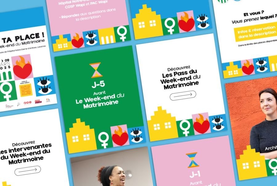
Four weeks of the same five shapes
The digital set had to carry the programme itself, day by day.
Speaker portraits, pass explainers, a countdown from J-5 to J-1, carousels for the practical detail. Different content every day, for a month.
The grid became a band along one edge of every post. Photography sits above it, type sits above it, and the band never moves.
The band makes a photographed portrait and a flat green countdown read as the same campaign.
07
Outcome
What the weekend left behind
The first edition ran from 7 to 9 March 2025.
You judge a first edition on whether there is a second one, and on what people keep. The rest is a poster on a wall for three weeks.
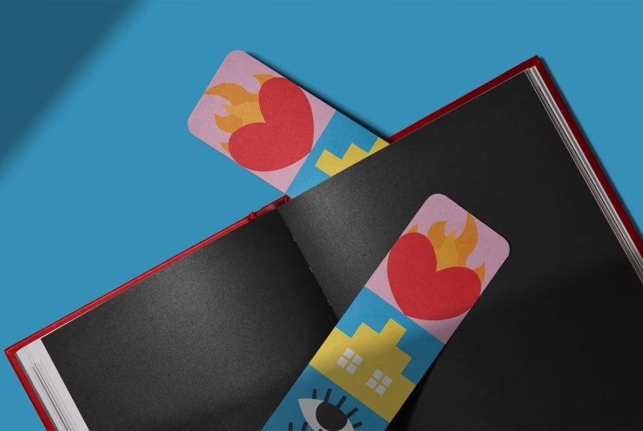
The bookmark is the piece I would keep. It is the smallest object in the set, the only one that goes home in a bag, and it carries no title and no date. One column of the same squares, and you still know which event it is.
One grid.
Every format after that was arithmetic.